🌐 Global Search
Effortlessly discover any data point throughout your contact center environment with Unified Global Search. This intuitive search tool enables you to instantly access call transcripts, agent logs, SMS, contacts, exchanges, dialer records, delivery reports, and performance dashboards—all from a single location. Highlights:- Unified Search Access: Simultaneously query calls, AI agent logs, SMS histories, dialer runs, and campaign analytics.
- Smart Filters: Narrow your results by fields such as date, agent, number, message content, or event classification to zero in on precise data.
- Seamless Navigation: Jump directly from search hits to corresponding analytics views, call records, or SMS threads for thorough follow-up.
- Proactive Issue Detection: Surface anomalies, errors, or compliance flags using keyword or error code searches.
📊 Dashboard Analytics
Transform your call center insights with powerful analytics that drive performance optimizationThe Dashboard Analytics provides comprehensive insights into your call center performance across AI, Dialer, and SMS operations. Access real-time metrics, historical data, and performance trends to optimize your communication strategies.
🎯 Overview
The analytics dashboard is organized into three powerful sections designed to give you complete visibility into your operations: 🤖 AI Analytics AI agent performance and call intelligence 📞 Dialer AnalyticsTraditional dialer call metrics and ratios 💬 SMS Analytics Message delivery and engagement statistics
🧭 Navigation Access analytics through the main navigation sidebar:
- Navigate to Dashboard → Analytics
- Select your desired analytics view: AI, Dialer, or SMS
💡 Pro Tip: Use the quick filter options at the top of each section to drill down into specific data sets.
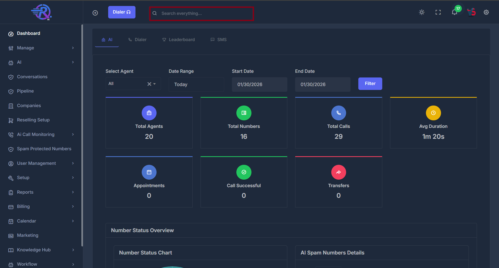
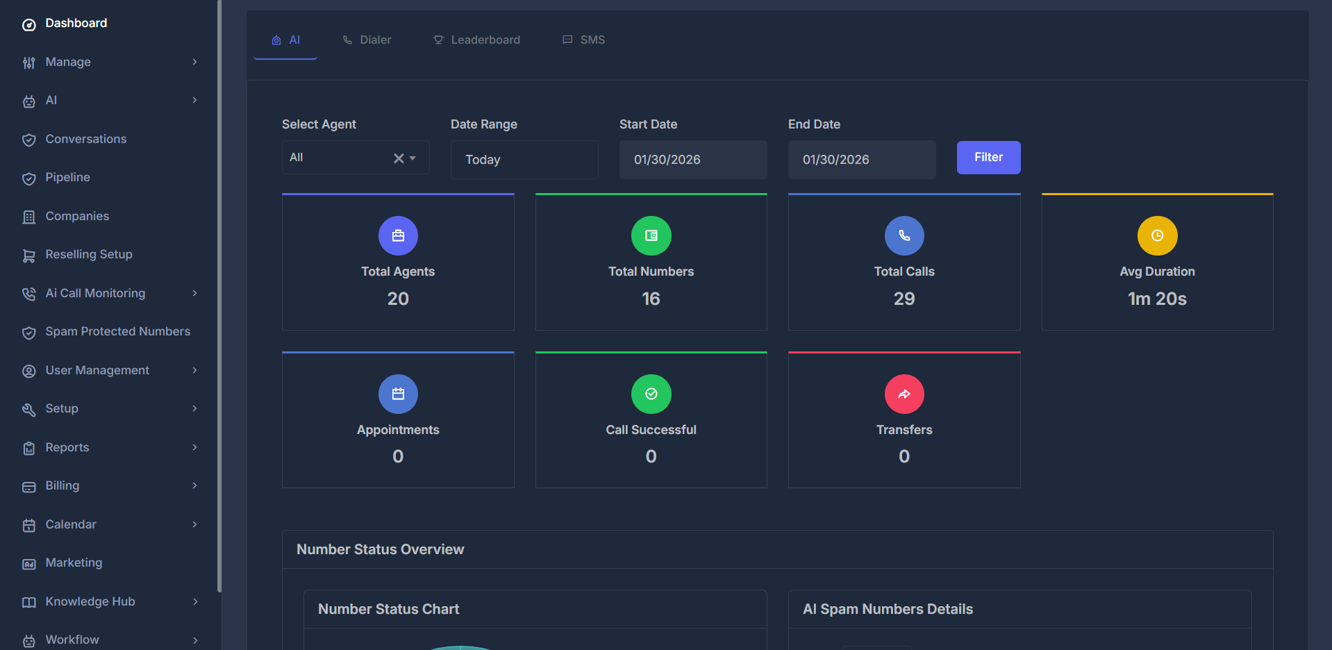
🤖 AI Analytics
The AI Analytics section provides comprehensive insights into AI agent performance and call intelligence.📞 Number Status Overview
Monitor and manage your phone number health with comprehensive spam detection and status trackingThe Number Status Overview displays the current status of all phone numbers you have purchased for your AI agent. It helps you monitor which numbers are clean, which are flagged as spam, and ensures you can manage your AI agent’s phone number inventory effectively.

- Clean Numbers: These are numbers that are ready to use and have no issues—shown as a teal segment in the donut chart.
- Flagged Numbers: These numbers have issues or are not ready to use—displayed in red to highlight attention needed.
- Total Numbers: Shows the total count of all purchased numbers.
| Column | Description | Functionality |
|---|---|---|
| # | Row number | Sequential numbering |
| Phone Number | Full phone number | Click to sort ascending/descending |
| Nickname | Custom number identifier | Sortable by name |
| Spam Status | Current spam detection status | Sort by clean/flagged status |
| Area Code | Geographic location code | Sort by region |
| Inbound | Incoming call volume | Sort by call activity |
| Outbound | Outgoing call volume | Sort by call activity |
🎛️ Filters
The Transfers by Agent chart respects your dashboard filters:- Agent Filter: View all agents or select a specific agent
- Date Range: Choose from Today, Yesterday, This Week, Last 7/30 Days, This Month, Last Month, or Custom dates
- Custom Date Range: Select your own start and end dates, then click Filter
🔍 Filtering Options Refine your analytics view with powerful filtering capabilities:
- Select Agent: Filter by specific AI agent or view all
- Date Range: Choose from predefined periods (Today, Yesterday, This Week, etc.)
- Start Date: Custom start date selection
- End Date: Custom end date selection
📈 Key Metrics
Monitor essential AI performance indicators with real-time updates:| Metric | Description | Impact |
|---|---|---|
| Total Agents | Number of active/inactive AI agents | Scale your operations |
| Total Numbers | Available phone numbers | Resource availability |
 | ||
| Total Calls | Total call volume | Activity level |
| Avg Duration | Average call length | Efficiency indicator |
 | ||
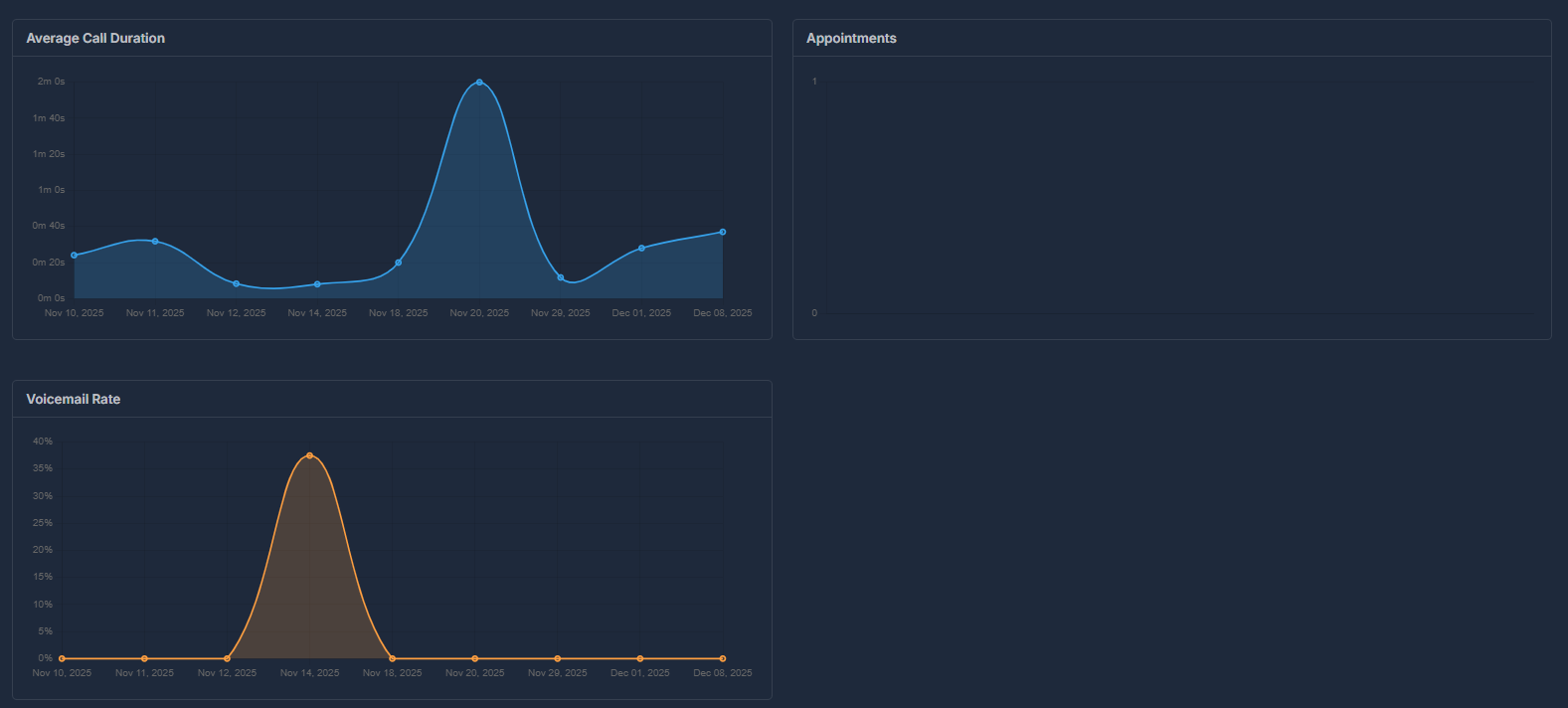
| Appointments | Total appointments generated within selected date range | Click to view detailed modal |
| Select Agent | Filter data by specific AI agent for appointment tracking | Select “All” to view appointments from all agents, or choose a specific agent to see only their appointments |
 | ||
| Appointment Details Modal | Interactive table showing all appointments with call details, agent info, contact numbers, duration, scheduling status, sentiment analysis, and recordings. Includes filtering, search, and pagination for easy navigation. | Comprehensive appointment tracking |
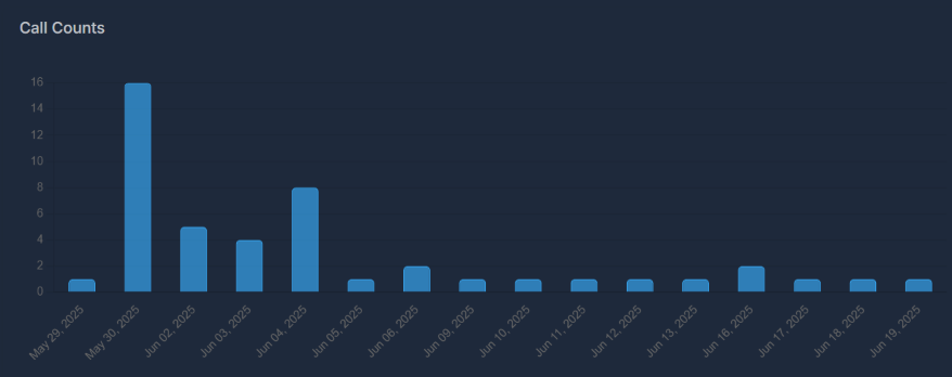 | ||
| Call Counts | Daily call volume trends | Activity monitoring |
 | ||
| Call Direction | Distribution of inbound, outbound, and web calls | Channel performance analysis |
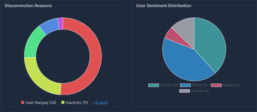 | ||
| Disconnection Reason | Analysis of call termination causes | Quality insights |
 | ||
| Transfer & Voicemail | Analysis of call transfers and voicemail drops | Call handling insights |
| Average Call Duration | Mean duration of all calls within selected timeframe | Call efficiency and engagement tracking |
| Appointments | Total appointments scheduled within selected timeframe | Conversion and booking success tracking |
 | ||
| Call Rate | Success rate of calls over time | Performance tracking |
| Transfer by Agent | Percentage of calls transferred by agents | Agent transfer efficiency tracking |

🔄 Call Transfers By Agent
Track and analyze when your AI agents transfer calls to human representativesA call transfer occurs when your AI agent hands off a call to a human representative or another phone number. This happens when callers request human assistance, complex issues arise, or your transfer criteria are met.
The Transfers by Agent chart shows which agents are transferring the most calls using a doughnut chart visualization.

| Element | Description |
|---|---|
| Colored Segments | Each color represents a different AI agent |
| Segment Size | Larger segments = more transfers by that agent |
| Center Space | Empty center for clean visualization |
- If “Agent Sarah” has the largest segment, she transferred the most calls.
- Smaller segments indicate agents with fewer transfers.
- Hover over any segment to see exact numbers.
- Click directly on a colored segment of the doughnut chart,
- Select an agent’s name from the legend below the chart,
- Or, if there are many agents, click the “+X more” link and pick an agent from the expanded list.
🔍 Transfer Details
When you click on an agent, the Transfer Details modal opens showing all transfer records for that agent.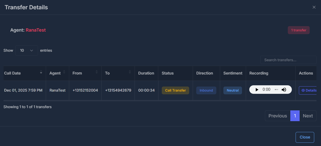
| Column | Description |
|---|---|
| Call Date | Date and time of the call |
| Agent | AI agent who handled the call |
| From | Caller’s phone number |
| To | Destination phone number |
| Duration | Call length |
| Status | Shows “Call Transfer” |
| Direction | Inbound or Outbound |
| Sentiment | Positive, Neutral, or Negative |
| Recording | Audio player to listen to the call |
| Actions | View complete call details |
- Search: Find specific calls using the search box
- Sort: Click column headers to sort
- Pagination: Navigate through pages
- Entries: Choose 10, 25, 50, or 100 rows per page
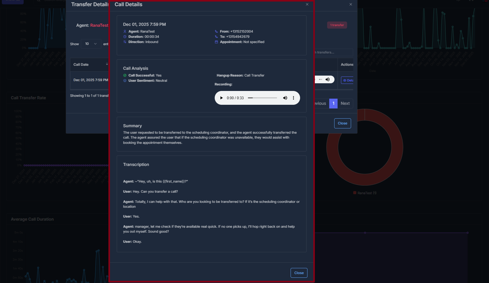
- Call info panel: Displays agent name, call date and time, duration, direction (inbound/outbound), source and destination numbers, and appointment info (if available).
- Call Analysis: Highlights whether the call was successful, sentiment classification (Positive, Neutral, or Negative), and the reason for call hangup (e.g., “Call Transfer”).
- Recording player: Listen to a real call audio file right in the modal—press play to review the interaction.
- Summary: A concise text explanation of what happened during the call, such as who the user was transferred to and what actions the agent took.
- Transcription: Read a detailed, line-by-line transcript of the call so you can quickly scan how the conversation unfolded.
📞 Dialer Analytics
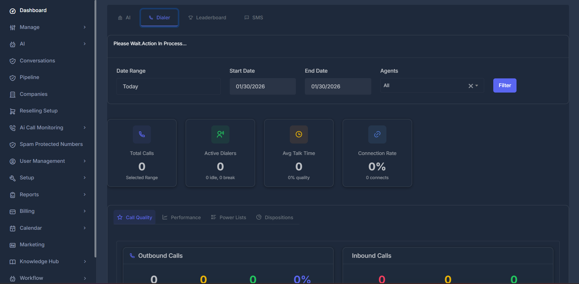
Transform your call center insights with powerful analytics that drive performance optimizationThe Dialer Dashboard is your central hub for monitoring and analyzing call performance across your team. It provides real-time insights, historical trends, and detailed analytics to help you make data-driven decisions.
- Navigate to Dashboard from the sidebar
- Click on “Dialer” tab at the top
- Start exploring your call analytics!
🔍 Filters & Controls
Located at the top of the dashboard, these powerful filters control what data you see across ALL tabs. Master these controls to unlock deep insights into your team’s performance.📅 Date Range Filter
Choose from quick shortcuts or create custom date ranges:| Option | Description |
|---|---|
| Today | Shows today’s activity only |
| Yesterday | Previous day’s complete data |
| This Week | Current week (Sunday/Monday to today) |
| Last Week | Complete previous week |
| Last 7/14/30 Days | Rolling date windows |
| This Month | Current month’s data |
| Last Month | Previous month’s data |
| Custom dates | Choose any date range |
- Select “Custom dates” from dropdown
- Choose your Start Date from the calendar
- Choose your End Date from the calendar
- Click “Filter” button to apply changes
💡 Pro Tip: Use custom dates for specific campaign periods, quarterly reviews, or comparing performance across different timeframes.
👥 Agents Filter
Select which team member’s data you want to view:- All → Combined data for entire team (team overview)
- Individual Agent → Specific person’s performance (individual coaching)
- Solo users: The dropdown hides itself (you’ll always see your own data)
- No team yet? The dropdown will show “Team Not Setup”
📈 Top Statistics Cards
Six key metrics displayed at the top provide an instant performance overview at a glance. These cards update automatically based on your selected filters.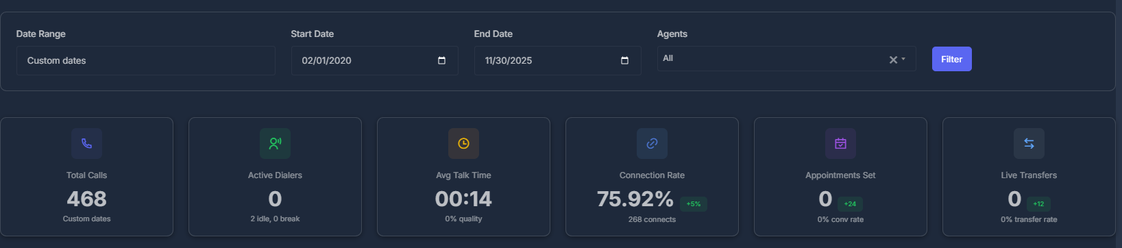
📊 Metric Breakdown
| # | Metric | What It Shows | Why It Matters |
|---|---|---|---|
| 1 | Total Calls | Total number of calls in selected date range | Activity level indicator |
| 2 | Active Dialers | Number of active team members | Team engagement status |
| 3 | Avg Talk Time | Average call duration (MM:SS format) | Efficiency measurement |
| 4 | Connection Rate | Percentage of calls that were answered | Success rate indicator |
| 5 | Appointments Set | Number of appointments booked | Conversion tracking |
| 6 | Live Transfers | Number of calls transferred | Support escalation rate |
- Label: Changes dynamically based on filter (e.g., “Today”, “This Week”, “Last Month”)
- Use Case: Track daily, weekly, or monthly call volume trends
- Details: Shows idle and break counts
- Definition: Active = Made a call in last hour
- Use Case: Monitor team availability and engagement
- Format: MM:SS (minutes:seconds)
- Use Case: Measure conversation quality and efficiency
- Details: Shows total number of connects
- Formula: Connected Calls ÷ Total Calls × 100%
- Higher = Better performance
- Use Case: Track call success rate and campaign effectiveness
- Details: Shows conversion rate percentage
- Based on: Disposition marked as “Appointment”
- Use Case: Measure booking success and conversion rates
- Details: Shows transfer rate percentage
- Use Case: Monitor support escalation and team collaboration
⭐ Call Quality Tab
The Call Quality tab provides a detailed breakdown of your call performance with visual charts and comprehensive metrics. This is your go-to view for understanding call distribution and success rates.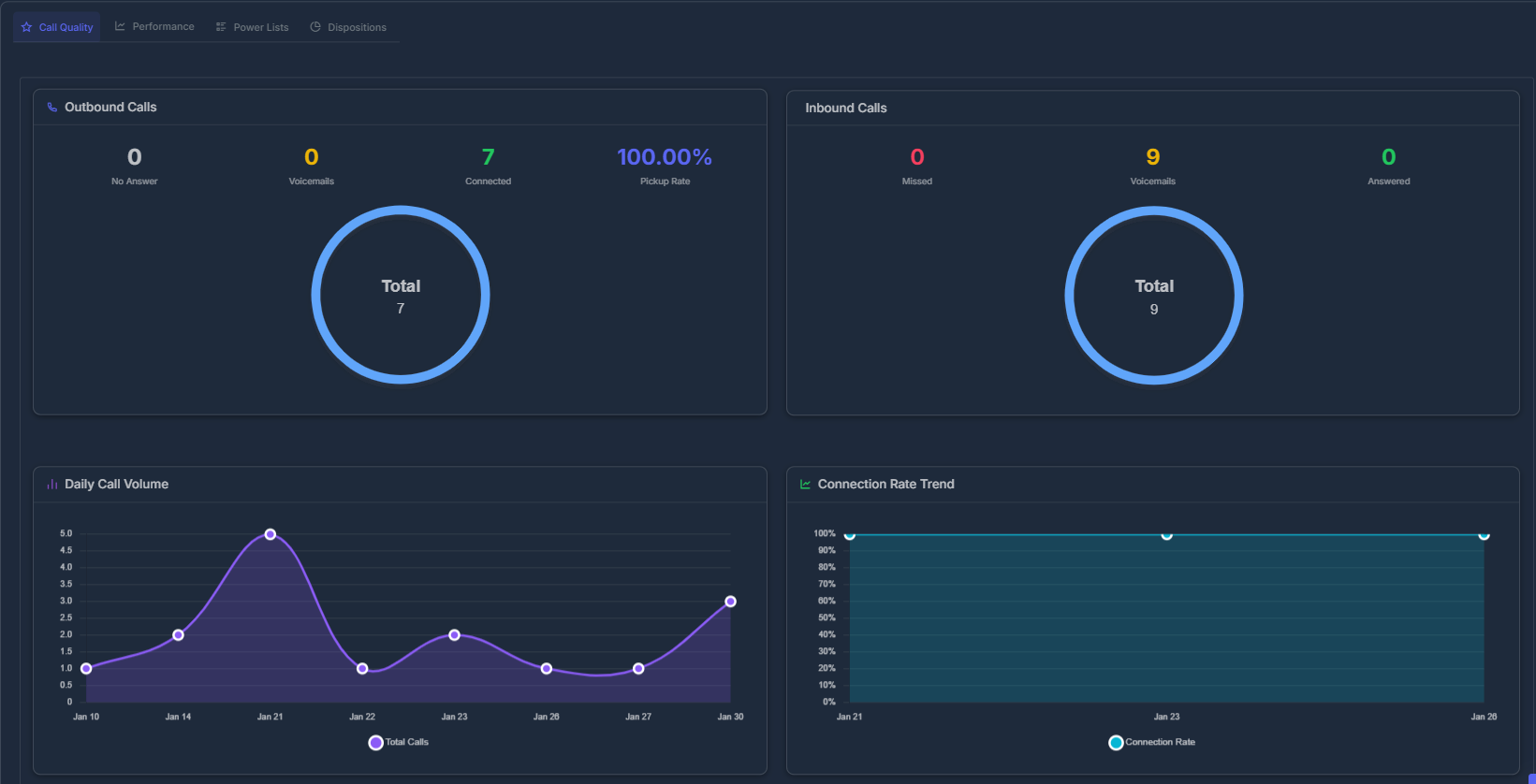
🥧 Call Ratio at a Glance
A colorful circle chart instantly shows your team’s ratio of incoming vs. outgoing calls—complete with percentages and total call counts. What You’ll See:- Incoming Calls: All calls received (answered, missed, voicemail)
- Outgoing Calls: All calls made (connected/unanswered)
- Visual Balance: Instantly see if you’re making more calls or receiving more
| Metric | Description |
|---|---|
| No Answer | Calls that weren’t picked up by recipients |
| Connected | Successfully answered calls |
| Pickup Rate | Percentage of answered calls (Connected ÷ Total × 100%) |
| Metric | Description |
|---|---|
| Missed | Calls you didn’t answer |
| Voicemails | Messages left by callers |
| Answered | Successfully handled calls |
- What it shows: Number of calls per day
- Timeline: Intelligently adapts to your date range
- Short ranges: Daily breakdown (day by day)
- Long ranges: Monthly breakdown (month by month)
- Smart Labels: Automatically shows years when viewing multiple years
- Use Case: Identify peak calling days and activity patterns
- What it shows: Success rate over time
- Metric: Percentage of answered calls
- Trend Analysis: Helps identify performance patterns
- Use Case: Track improvement or decline in connection rates
🚀 Performance Tab
The Performance tab shows intelligent charts that adapt based on your selected date range. These adaptive visualizations help you understand trends and patterns across different time periods.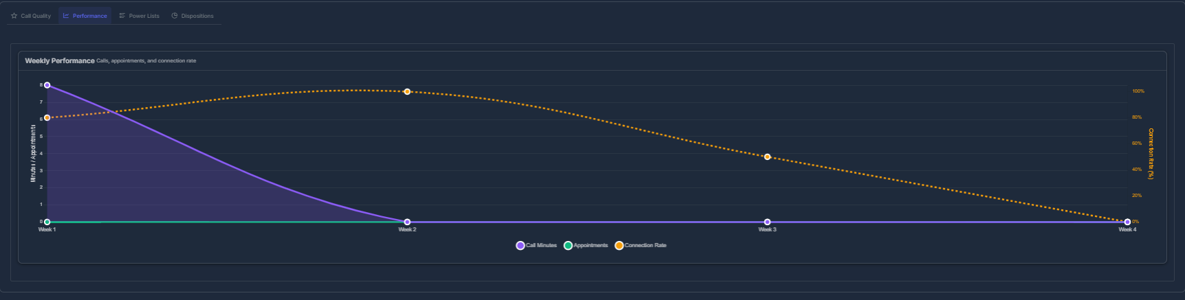
| Time Range | Display Format |
|---|---|
| Today | Hourly breakdown (8 AM, 9 AM, 10 AM…) |
| This Week | Daily breakdown (Mon, Tue, Wed…) |
| This Month | Weekly breakdown (Week 1, 2, 3, 4) |
| Yearly/Long Range | Monthly breakdown (Jan, Feb, Mar…) |
📊 Three Performance Lines
The chart displays three key metrics simultaneously:-
🟣 Purple Line (Call Minutes)
- Total talk time in minutes
- Measures conversation duration
-
🟢 Green Line (Appointments)
- Number of appointments set
- Tracks booking success
-
🟠 Orange Dashed Line (Connection Rate)
- Success percentage
- Shows call answer rate
- Hover over any point to see exact values
- Compare trends across different metrics
- Identify peak performance periods
- Spot correlations between metrics
💡 Pro Tip: Look for patterns where high call minutes correlate with high appointments—this indicates effective conversations leading to bookings.
📋 Power Lists Tab
Easily track performance and progress across all your power lists with clear analytics and completion tracking. This section helps you monitor which lists are performing, spot bottlenecks, and manage campaign completion—right from a single dashboard.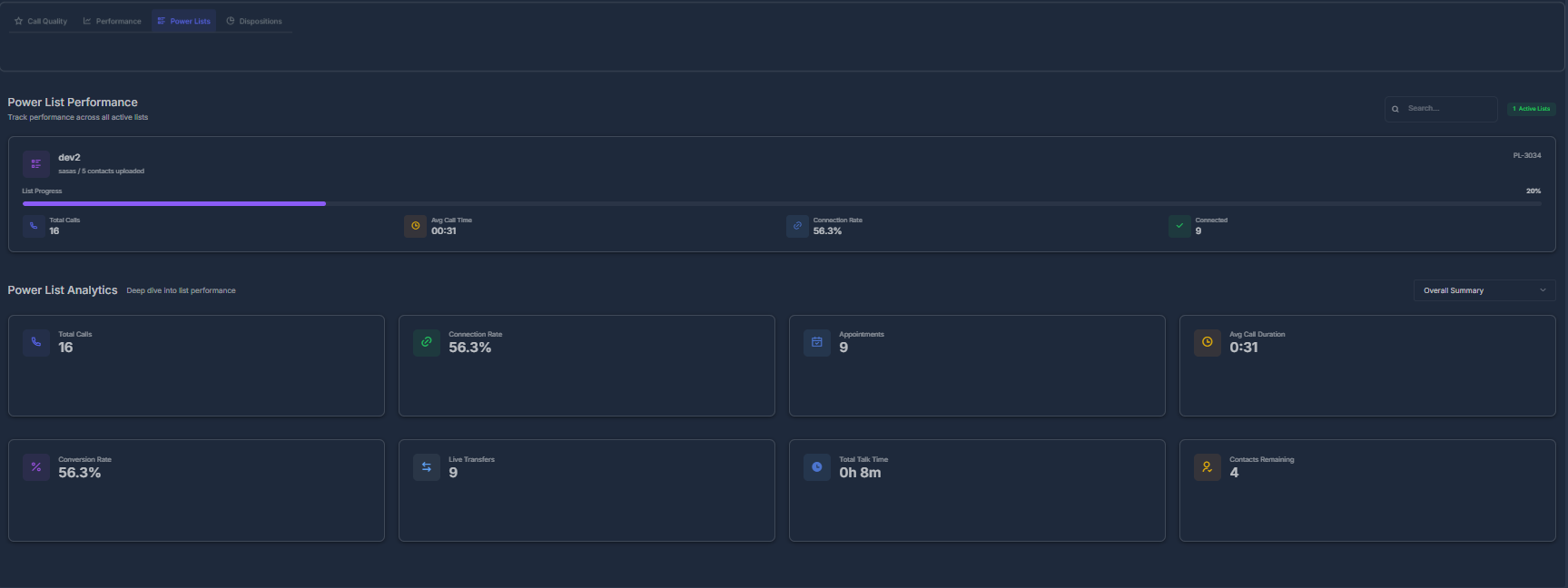
🔹 Power List Performance
- Search and filter through all Power Lists with the search bar at the top right and filter button for quick access.
- Each Power List row or card displays:
- List Name (e.g., “dev1”)
- Progress Bar — shows how many contacts have been reached, both numerically (“X / Y”) and as a percentage, with a solid progress indicator.
- Status Badge — visually shows if the list is active or completed.
- Key Metrics for each list:
- Total Calls — How many calls have been made on this list.
- Connection Rate — Shows the success percentage (e.g., “56.3%”).
- Avg Call Time — Average call length for the list (e.g., “0:31”).
- Connected — Number of successful/connected calls.
- Quickly review progress, completions, and campaign health at a glance.
📊 Power List Analytics Get a summary of performance for all power lists in your dashboard with dedicated analytics cards.
-
Each metric is shown in its own card for quick visual reference:
Metric Value Example Description Total Calls 16 Total calls placed to all power lists combined Connection Rate 56.3% Percent of calls that reached and connected Appointments 0 Total appointments booked from these calls Avg Call Duration 0h 8m Average call duration in hours/minutes Conversion Rate 56.3% Percentage of converted leads/calls Live Transfers 0 Number of calls transferred to a human Total Talk Time 0h 8m Combined talk time across all calls (formatted xh ym) Contacts Remaining 47 Number of un-contacted leads left in all lists - All values update according to your selected date range and filter options at the top of the page.
- Cards provide a clear overall campaign health metric so you can act quickly if engagement is dropping.
How to Use:
- Use the search and filter bar to quickly narrow down large numbers of power lists.
- Progress bars and status indicators help you prioritize which campaigns need attention.
- Use analytics totals to spot trends and address low-connection or low-conversion lists.
📊 Dispositions Tab
Visual representation and detailed breakdown of call outcomes to understand what happened after calls ended. This tab helps you analyze call results and identify patterns in customer responses.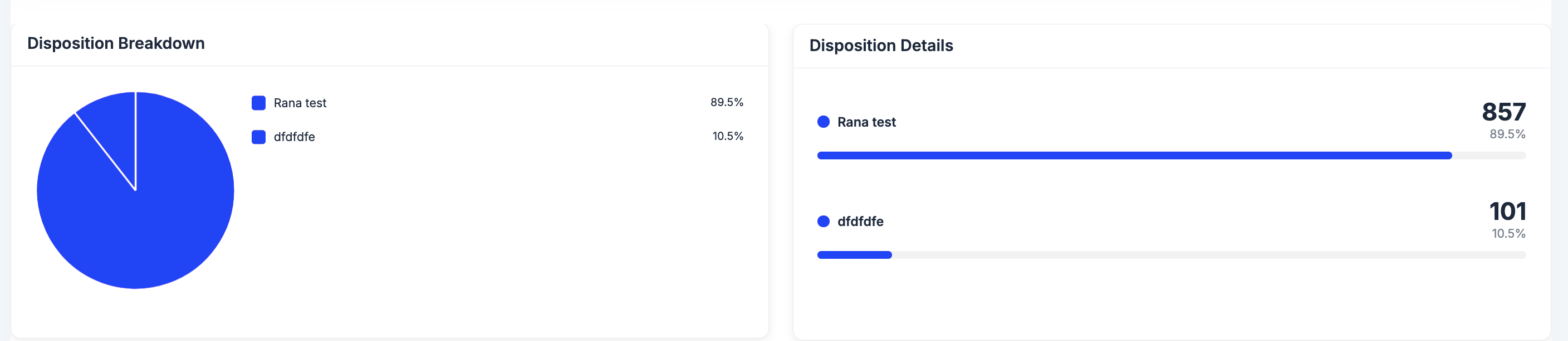
- ✅ Percentage distribution of each disposition
- ✅ Color-coded segments for easy identification
- ✅ Total count for each outcome
- ✅ Interactive hover details
- 📅 Appointment Set → Successfully booked appointments
- 🔄 Live Transfer → Calls transferred to specialists
- 📞 Call Back → Scheduled follow-up calls
- ❌ No Answer → Unanswered calls
- 👎 Not Interested → Declined offers
- 📧 Voicemail → Messages left
🧮 How Are These Numbers Calculated?
Understanding the calculations behind your metrics helps you interpret the data accurately and make informed decisions. 📊 Calculation Formulas| Metric | Calculation Method |
|---|---|
| Incoming Calls | All calls flagged as “Inbound” (including completed, missed, and voicemails) |
| Outgoing Calls | Every call set as “Outbound” (both successful and missed) |
| No Answer | Outbound calls not marked as “Completed” |
| Connected | Outbound calls marked as “Completed” |
| PickUp Rate | Connected ÷ Outgoing × 100% |
| Missed Calls | Inbound calls not completed |
| Voicemails | Calls where voicemail was left |
| Answered | Inbound calls completed by your team |
| Talk Time | Combined duration of all completed calls (shown as hh:mm:ss) |
| Disposition Data | How many times each call outcome was selected in the time frame |
💡 Note: All calculations are based on your selected date range and agent filter settings.
🔄 Real-Time Automatic Updates
Experience seamless, instant data updates without manual refresh. How It Works:- ✅ Automatic Updates: Get fresh data the moment you switch any filter
- ✅ Instant Refresh: Select another agent or date range for immediate updates
- ✅ Progress Indicator: See a helpful “Please wait. Action in process…” message
- ✅ No Reload Needed: Everything updates instantly in the background
💡 Pro Tip: The dashboard updates in real-time, so you always see the most current data without clicking refresh.
🏅 Leaderboard
Gain live insight into your team’s achievements by reviewing rankings, comparing activity, and celebrating standouts. Use this tab to cultivate a culture of recognition and healthy competition, while identifying strengths and coaching opportunities across your workforce.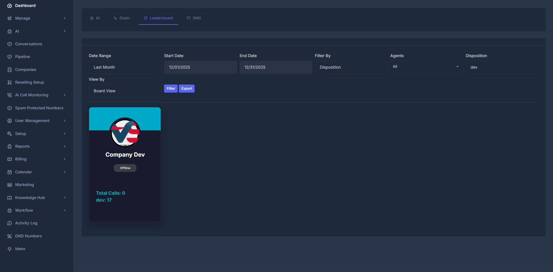
🎚️ Versatile Filtering & Display Controls
Filter Criteria- By Disposition: Identify agents most effective at setting appointments or progressing leads.
- By Dialer Activity: Highlight those consistently engaging in call outreach.
- By Subscription: Drill down to monitor performance by subscription tier or plan segment.
- Board (Card) View: Intuitive, engaging agent cards with profile photos and quick stats—great for shoutouts and visual leaderboards.
- List (Table) View: Condensed tabular format for advanced comparison, easy scanning, and quick sorting.
👤 What’s on Each Agent Card (Board View)?
Agent cards in the Board View surface key information for rapid assessment and motivation:- Agent’s Name & Photo: Foster personal recognition and team spirit.
- Status Lights: Instantly see if someone is Online 🟢, Busy (On Call) 📞, or Offline ⚫.
- Total Calls Initiated: Activity count for the chosen date range.
- Primary Metric: Displays the value most closely linked to your selected leaderboard filter (e.g., appointments, calls, minutes).
- Current Rank: See their live position on the leaderboard.
- Achievements & Badges: Quickly acknowledge top daily/weekly/monthly performers (if available).
📦 Data Export & Sharing Made Simple
Need to work with the data outside the dashboard? Just click “Export” to instantly download all leaderboard stats as a ready-to-use Excel spreadsheet. You can use exported data to:- Generate detailed performance reviews and custom reports
- Distribute insights to managers, stakeholders, or team members
- Maintain historical archives for tracking progress
- Dive deep with your own spreadsheets and analysis tools
Tip: Use Excel’s pivot tables or Google Sheets to create custom charts, analyze trends, or merge with other KPIs for broader business intelligence!
💬 SMS Analytics
See how your SMS is performing: how many you sent, how many were delivered, failed, or replied to, and how that changes over time.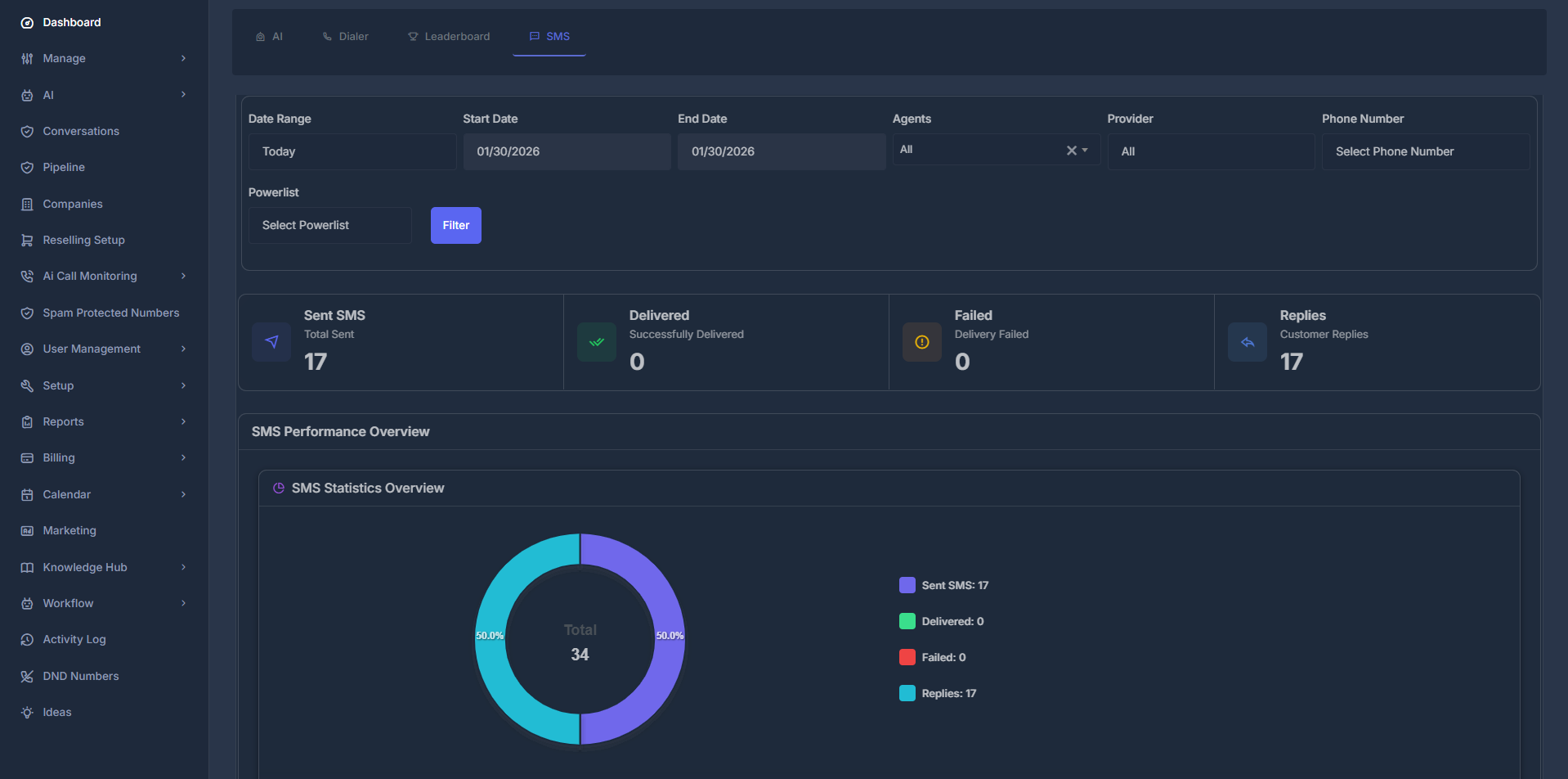
🎯 What You See Here
- Top: Filters (date, agent, provider, phone number, powerlist) so you can narrow the data.
- Middle: Four numbers — Sent, Delivered, Failed, Replies — that update when you change filters.
- Bottom: Charts (pie, donut, line) showing volume, delivery rate, and outbound vs inbound.
🎛️ Filters (Top of Page)**
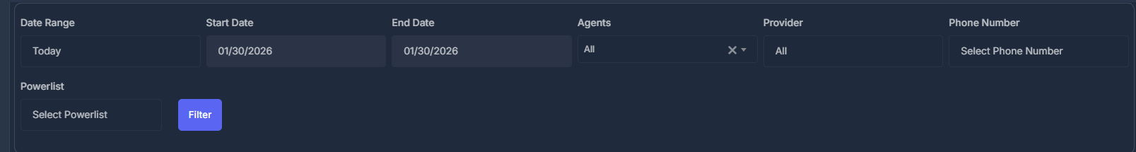
- 📅 Date Range — Today, Yesterday, This Week, Last 7/14/30 Days, This Month, Last Month, or Custom dates (then use Start/End date).
- 👥 Agents — All, Company, or a specific agent (options depend on account type).
- 📱 Provider — All, Ai Sync, Twilio, or Ai Sync V2. Changing this updates the Phone Number list.
- 📞 Phone Number — All numbers or one number; list depends on the provider you chose.
- 📋 Powerlist — All lists or one list; then click Filter to apply.
📊 The Four Numbers (Statistics Cards)

- 📤 Sent SMS — Total messages sent in the selected period.
- ✅ Delivered — How many reached the recipient.
- ❌ Failed — How many did not deliver.
- 💬 Replies — How many incoming messages you got.
📈 Charts (Performance Overview)
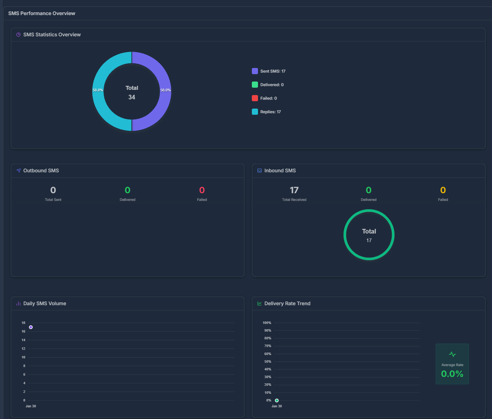
- 🥧 Pie chart — Split of Sent, Delivered, Failed, Replies (with counts).
- 📤 Outbound — Donut: messages you sent, by delivered vs failed.
- 📥 Inbound — Donut: messages you received, by status.
- 📉 Daily volume — Line graph: how many SMS per day (hover for exact count).
- 📈 Delivery rate trend — Line graph: % delivered per day; Average Rate shown on the right.
📖 Quick Definitions
- Sent = Left your system; Delivered = Reached the recipient’s phone. A message can be Sent but not yet Delivered.
- Outbound = You sent it; Inbound = You received it (replies).
- Statuses: Delivered (reached), Failed/Undelivered (didn’t reach), Pending (in transit), Sent (submitted).
📋 In Short Use the SMS tab to see sent vs delivered vs failed vs replies, and how that changes by date, agent, provider, or number. All numbers and charts update when you change filters.
🔧 Troubleshooting
❌ Common Issues- No Data Displayed: Ensure date range is set correctly and agents are active
- Missing Metrics: Verify agent permissions and data collection settings
- Filter Not Working: Check that selected agents are active and date range is valid
- Analytics data updates in real-time
- Historical data may take up to 24 hours to appear
- Contact support if data appears inconsistent